

Dated & Drab: Colors You Should Avoid in 2025 for Interior & Exterior Design
Introduction
As we step into 2025, the world of interior and exterior design is evolving rapidly, leaving behind outdated hues that no longer serve modern aesthetics. Choosing the wrong colors can make a space feel dull, uninspired, or even visually chaotic. At SA Designs and Associates, we believe that color choices should reflect contemporary trends while ensuring timeless elegance. Here’s our expert take on the colors you should avoid in 2025 and what to use instead.
1. Bland Beige & Overused Taupe
Why to Avoid It:
For years, beige and taupe have been the go-to neutrals, but their reign is fading. While these hues once provided a safe and warm backdrop, they now feel uninspiring and outdated. Overuse of taupe can make interiors appear lifeless, especially in modern, minimalist designs.
What to Use Instead:
Warm greiges (a mix of gray and beige) or soft earthy tones such as terracotta or warm sand create a more inviting and updated atmosphere.
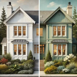
2. Stark White on Exteriors
Why to Avoid It:
Crisp white may have been a favorite for contemporary exteriors, but in 2025, it’s losing its charm. Bright white can look too harsh, especially in natural outdoor lighting, and requires constant maintenance due to dirt and discoloration.
What to Use Instead:
Opt for warm whites with creamy undertones or light sage greens that blend seamlessly with natural surroundings.
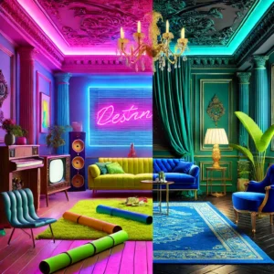
3. Neon Brights
Why to Avoid It:
Neon shades, from electric blue to highlighter yellow, were once bold statements in contemporary design. However, in 2025, they are being replaced by more subdued yet impactful colors. Neon hues can feel overwhelming and often clash with sophisticated décor styles.
What to Use Instead:
Try deep jewel tones such as emerald green or royal blue to maintain vibrancy without overpowering the space.
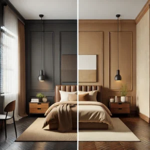
4. Dark Chocolate Browns
Why to Avoid It:
Deep chocolate brown was once the definition of warmth and coziness, but in 2025, it feels heavy and outdated. Overuse can make a space look cramped, especially in smaller rooms.
What to Use Instead:
Consider softer browns, like mocha or caramel, which still provide warmth but with a fresher appeal.
5. Pastel Pinks and Baby Blues
Why to Avoid It:
These delicate shades have been overused in nursery-inspired designs. In modern spaces, they can make a home feel overly juvenile and lack sophistication.
What to Use Instead:
Dusty rose or muted coral offer a refined alternative, adding a touch of warmth without feeling childish.

Conclusion
As design trends evolve, so should our color choices. The key to a stylish and timeless space in 2025 is opting for rich, warm, and nature-inspired hues while letting go of outdated tones. At SA Designs and Associates, we help clients curate palettes that enhance their interiors and exteriors with a modern yet timeless appeal.
Need help choosing the perfect colors for your space? Contact SA Designs and Associates today!
Stay ahead of the trends—design with confidence!
0 comments