Choosing a Material Palette for a Luxury Home
A material palette is the soul of a luxury interior. Our approach to selecting stone, wood, metal and texture so they work as one quiet, cohesive whole.
By SA Designs & Associates
Ask a designer where luxury lives in a home, and the honest answer is: in the materials. Not the quantity of them, but the rightness of their pairing. A considered material palette is what separates a room that looks expensive from one that feels refined — and the difference is felt the moment you walk in.
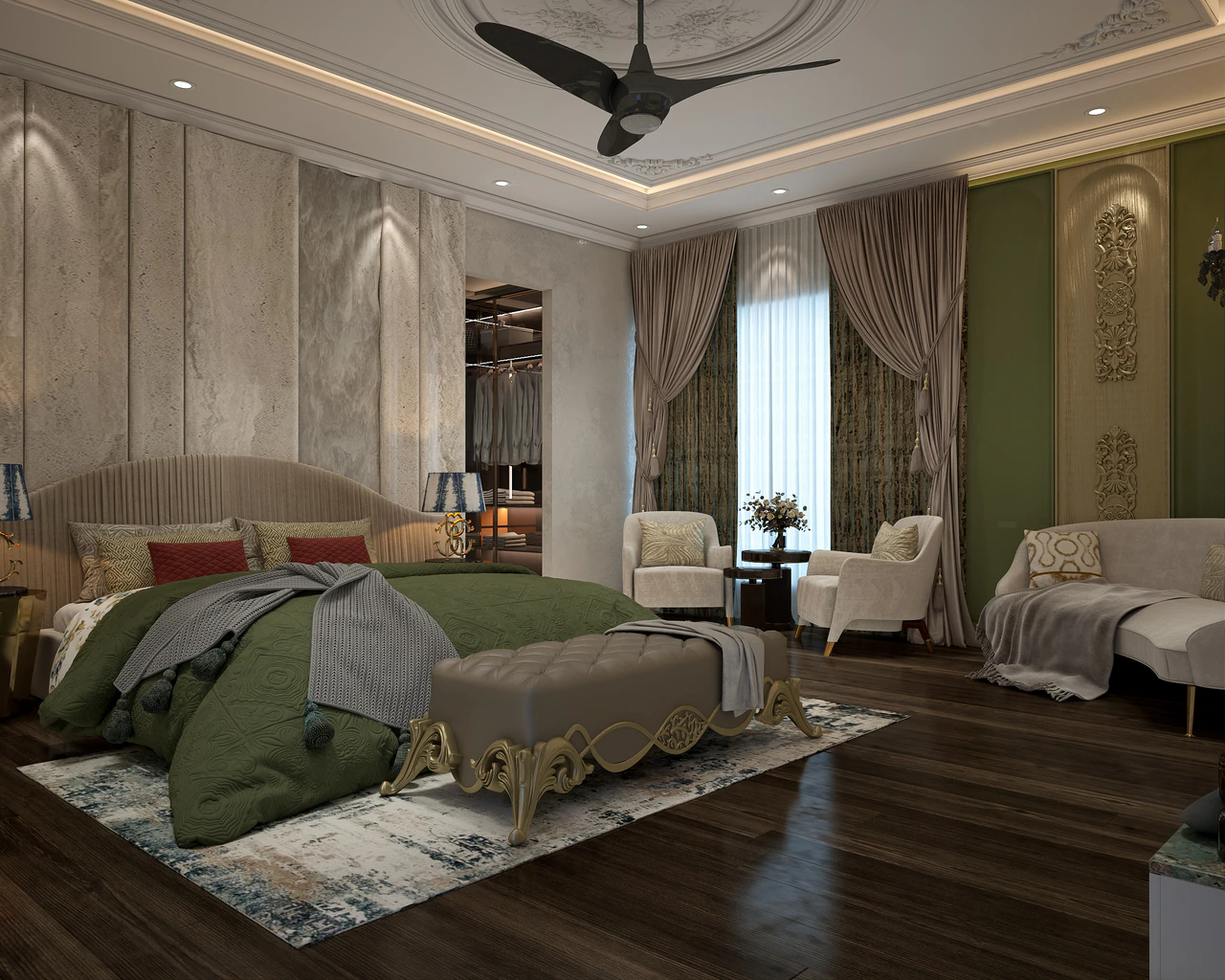
Start with one hero material
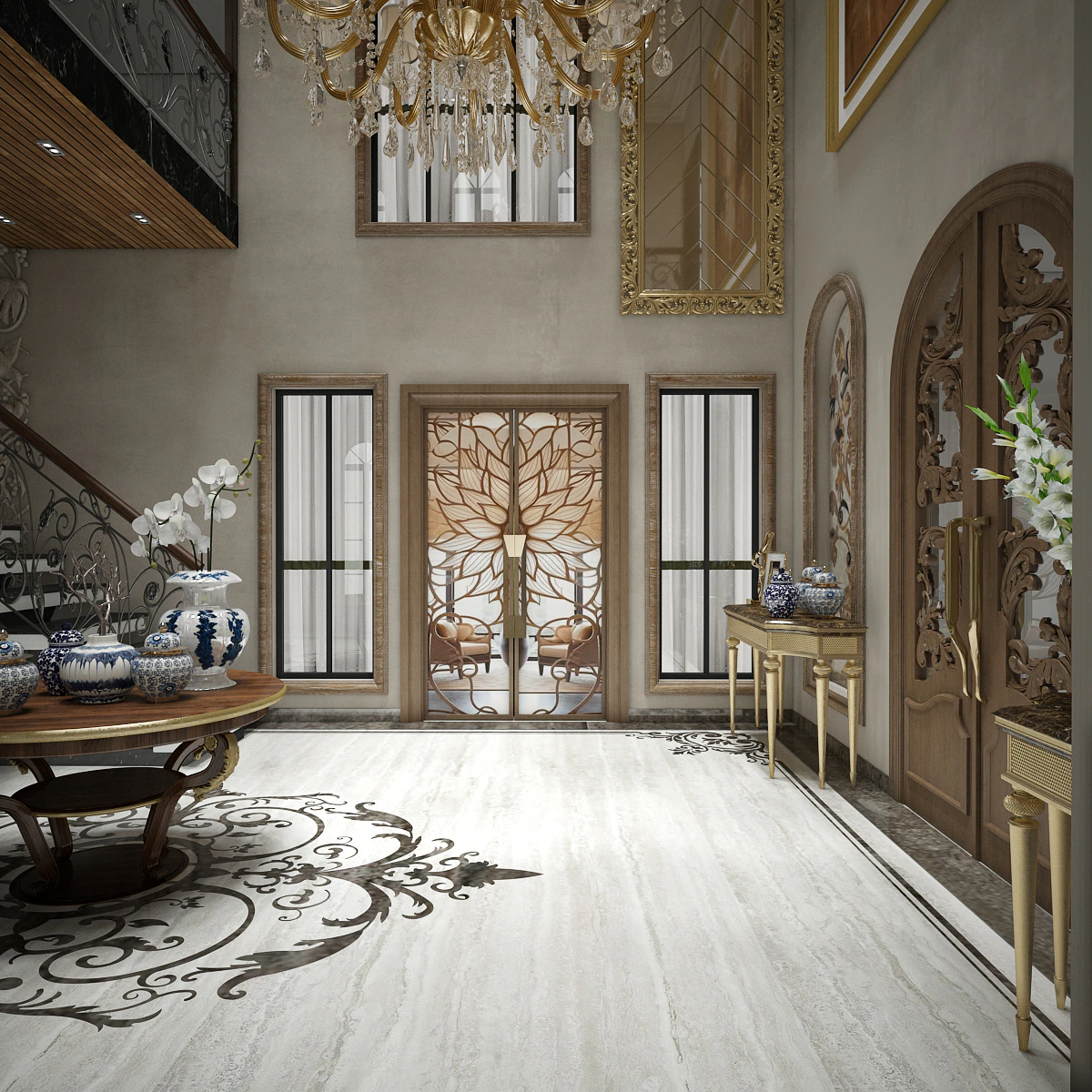
Every palette needs an anchor. Often it is a stone — a marble with a particular vein, a travertine with a warm tone. We choose this first and let everything else respond to it.
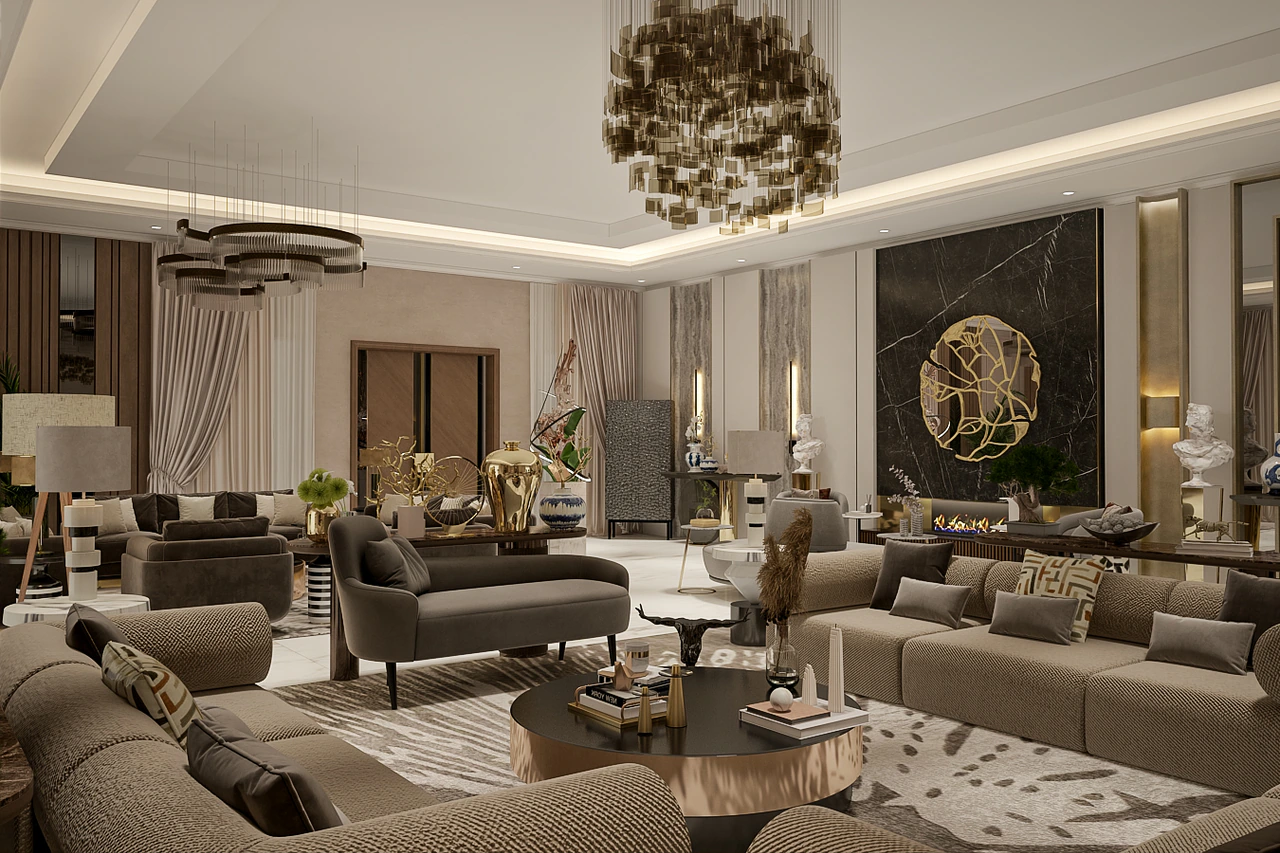
In the Care Beauty Residence, the marble came first; the metals, woods and textiles were all selected to flatter it.
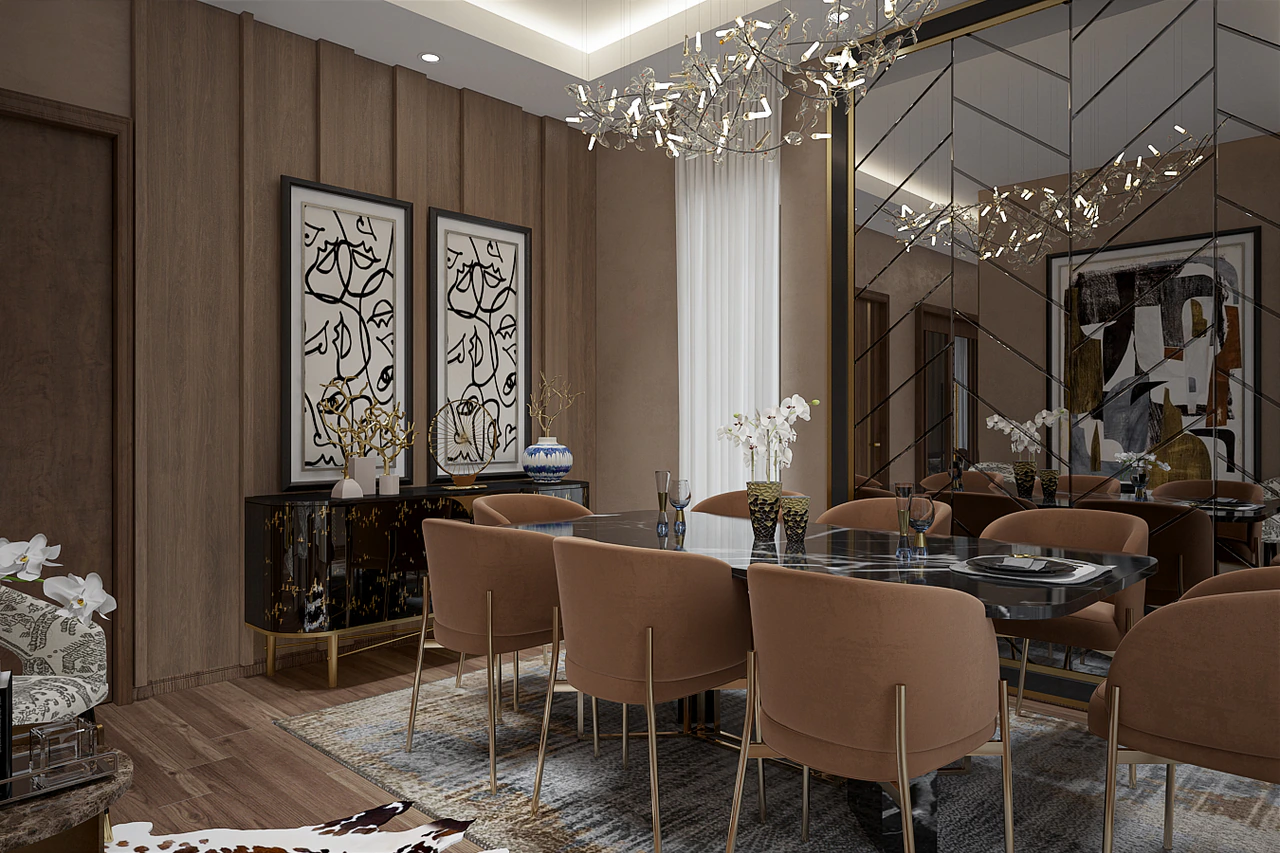
Build in threes
A reliable structure for a palette:
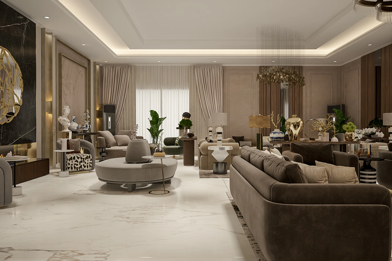
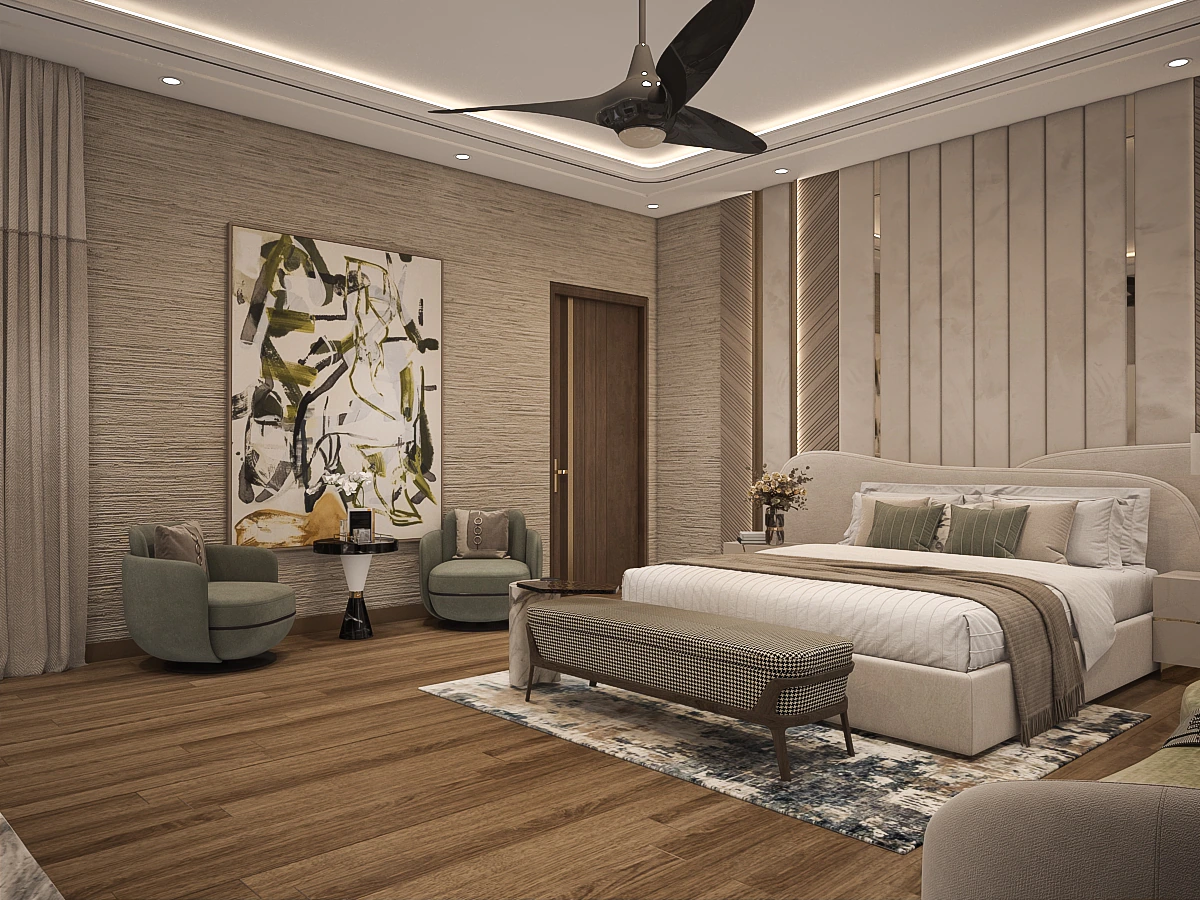
- A primary neutral — the dominant tone of walls, large surfaces and upholstery.
- A warm natural — wood or stone that adds depth and life.
- A precise accent — usually a metal, used in small, deliberate doses.
Three layers, in roughly a 70 / 20 / 10 balance, almost always reads as composed.
Two surfaces can share a colour and feel completely different. Texture is where a palette gains richness without adding noise.
Texture is the quiet luxury
Honed versus polished stone, matte versus lacquered wood, bouclé versus linen — texture is what gives a restrained palette its depth. We specify finish as carefully as colour.
Test materials in the actual light
A sample looks one way in a showroom and another in the room it will live in. We always review materials together, at scale, in the project's own daylight before committing. Light changes everything — a beige that felt warm under halogen can turn grey by a north window.
A great palette is invisible in the best way: nothing competes, nothing clashes, and the eye simply rests. That quiet harmony — achieved through restraint and care — is the truest signature of a luxury home.
Work with us
Have a space you’d like to transform?
We take on a select number of residential and commercial projects each year. Let’s talk about yours.
Start a project